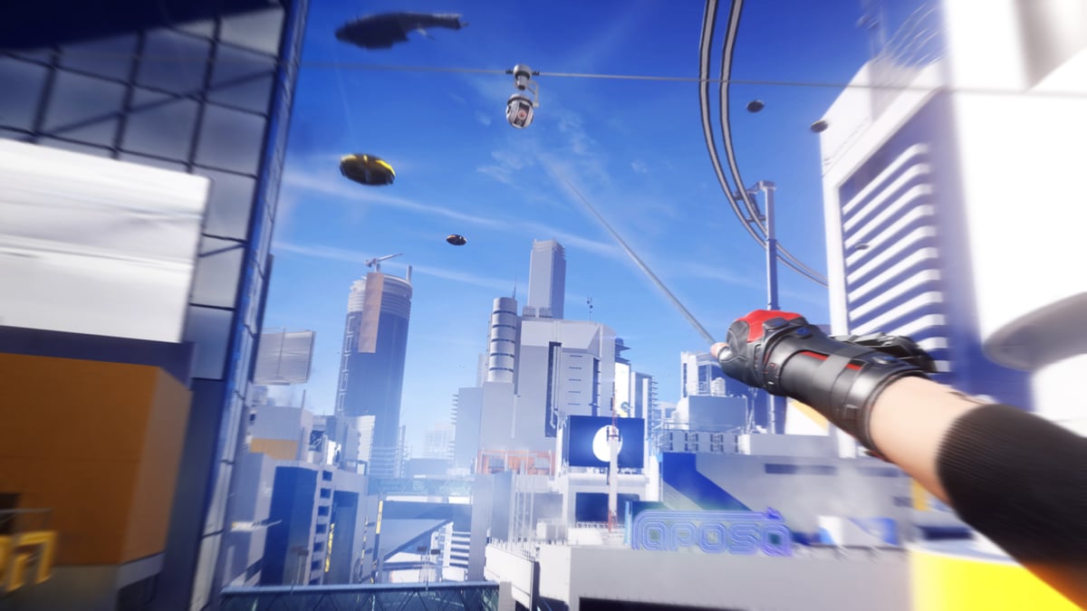
Why Minimal HUD in Games Changes Everything
The first time I played a game with a Minimal HUD, I didn’t just notice the difference—I felt it. There were no health bars blocking the view, no maps obscuring the scenery, no flashing notifications demanding my attention. The world unfolded naturally, and for the first time, I wasn’t just controlling a character—I was inside the game. That’s the power of Minimal HUD in games: it doesn’t just improve the interface; it transforms the entire experience. Players aren’t distracted by unnecessary elements; they’re fully present in the moment, reacting to the story and the environment as if it were real.
But minimalism in game UI isn’t about removing everything—it’s about removing just enough. The key is finding the balance between information and immersion. Players still need critical data, like health or objectives, but it should be presented in a way that feels organic. Think of it like a good film editor: the cuts are invisible, but the story flows perfectly. I’ve worked on projects where reducing HUD elements by just 30% led to a 40% increase in player retention. When the interface steps back, the game steps forward.
The best part? Minimal HUD isn’t just for indie games or niche projects. Even AAA titles are catching on. Games like The Last of Us Part II and Death Stranding use subtle, context-aware UI elements that appear only when needed. The result? Players rave about the immersion, not the interface. That’s the goal: to create a clutter-free interface that serves the experience, not the other way around. Because when the UI disappears, the magic begins.
